


Modern Web Typography: Crafting Engaging and Accessible Digital Text

In web design, typography serves to create a seamless conversation between content and user rather than just text arrangement.
As the most basic element of web design, typography influences user interaction with content, website navigation, and brand perception. Although graphic components like images or animations usually take front stage, good typography is the backbone of user experience since it combines aesthetic appeal with practicality. Here’s how designers could improve their web typography to meet modern norms.
The Art of Typeface Selection
Typography starts with selecting a typeface that will speak for your design. A well selected typeface promotes readability and expresses the character of a brand. While sans-serif fonts reflect modernity and minimalism, serif fonts represent tradition and authority. Custom web fonts—like those from Google or Adobe—offer creative flexibility but must be carefully considered in load speeds to provide seamless device experiences.
Evolution of Web Typography
Historical Context: Early 2000s saw significant developments in web design. CSS @font-face let designers include customized fonts without depending on system-installed fonts. Along with improvements in jQuery, HTML5, and CSS3, this independence provided further typographic creative possibilities.

Impact of Browser Compatibility: Modern web design depends critically on consistent font across browsers, including older versions like Internet Explorer. TTFGen and other jQuery plugins enable developers to create interoperable font styles, therefore guaranteeing consistent typography on all browsers. This method not only preserves design integrity but also improves accessibility and user experience, therefore enabling the content to be more inclusive for all users.
Establishing Text Hierarchy and Readability
Establishing a visual hierarchy facilitates users’ intuitive navigation across content. Key strategies include:
- Font Sizing: For headlines, use strong, bigger fonts; for body text, use smaller, consistent fonts.
- Spacing: For readability, vary line height (1.4–1.6x font size) and letter spacing.
- Contrast: For accessibility, make sure text and backdrop contrast properly.
Responsive Typography
Modern websites have to fit a multiscreen environment in which users interact via desktop computers, tablets, and smartphones. Fonts can scale smoothly with techniques including fluid typography and CSS viewport units (e.g., vw and vh). Combining this with media queries guarantees your typeface fits various screen sizes without compromising legibility.
Accessibility Principles
Accessible typography not only enhances inclusivity but also improves usability for all. Design with:
- Scalable Text: Let users change text without compromising designs.
- Color Contrast: High-contrast text will improve your visibility.
- Logical Structure: Incorporate lists, subheads, and clear headings to help navigation.
Experimenting with Trends and Innovation
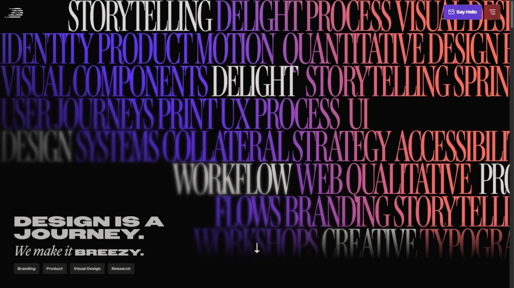
Typography evolves with design trends to bring together utility and creativity. Variable typefaces, for example, enable dynamic adjustments to weight and width, therefore boosting performance without compromising appearance. For additional visual appeal, designers are also looking at asymmetrical layouts and kinetic typography.
Tips for Effective Web Typography
- Pair Fonts Wisely: For body text and headings, pair complimentary typefaces.
- Optimize Load Times: Limit the custom font count to maintain site performance.
- Test across devices: Ensure that fonts on all screen sizes are visually balanced and legible.
- SEO Implications of Headers: It’s imperative to highlight heading tags in SEO as well as in visual hierarchy. Google uses headings like h1 and h2 for indexing material, hence these tags are absolutely important for search engine optimization (SEO). Including keywords inside these headers might help a website show better online and get higher ranking.
Using Hyperlinks Effectively
Anchor Text and Engagement: The blog notes that carefully written anchor text can inspire user engagement. Replace generic words like “click here” with descriptive link language that suggests what users will discover following a click. This improves both user experience and SEO by associating the linked content with relevant keywords.
List Styling for Clear Communication
Clear separation between list elements helps to increase readability when constructing lists—ordered or unordered (bulleted). Simple methods like indentation, bolding, and adequate space help set lists apart from paragraphs, therefore strengthening the whole visual structure.
In-Page Quotes and Blockquotes
Designing Blockquotes for Emphasis: Blockquotes provide graphic breaks emphasizing relevant information or references, hence strengthening crucial citations. The blockquote elements of HTML5, including the footer tag for referencing sources, offer chances to produce visually striking and semantically clear quotes in your design.

Custom Web Fonts and Integration
Adobe Fonts vs. Google Fonts: While Google Fonts is free and adaptable, Adobe Fonts provides more customizing choices—especially for high-traffic websites or those requiring particular font families.
White Space and Visual Hierarchy
Adequate spacing around typography elements, particularly headers, is essential. White space separates elements, so that readers may concentrate on individual components without becoming overwhelmed by jumbled content. Combining this with font size variances—that is, bigger for headers—allows a clear visual hierarchy.
Conclusion
In web design, typography serves to create a seamless conversation between content and user rather than just text arrangement. Designers may create typography that not only communicates clearly but also makes a lasting impression by adopting responsive techniques, giving accessibility top priority, and keeping tuned to design improvements. Your typeface decisions, as the silent ambassador of your business, can change impressions and improve online experiences.